News & Notes
Hamilton: The Exhibition — An annotated photo tour

By: Peter Linett
May 28, 2019
I’m not usually a fan of those big-budget “blockbuster” exhibitions that are mounted by non-museum producers in touristy, non-museum spaces. But I am a huge fan of the musical “Hamilton,” Lin-Manuel Miranda’s genius rewiring of the American founding story. So I was charged up to see the new exhibition on Chicago’s lakefront, backed by the Broadway show’s lead producer and designed and curated by its Tony Award-winning set designer, David Korins.
I wasn’t disappointed. The exhibition is exactly what the musical deserves, and what a museum would never do.
I’ll be writing a real review in Curator: The Museum Journal, so stay tuned. And by all means, get your own body through the door if you’re anywhere near Chicago, whether you’re a fan of the musical, a fan of U.S. history, or a museum or culture professional who wants to see what can happen when a big budget meets even bigger ideas. For now, here’s a quick tour.
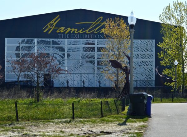
You approach the hangar-sized shed that houses Hamilton: The Exhibition on an unprepossessing patch of city parkland…
An introductory film projected on a curved, billowy screen (not pictured) features Miranda and Phillipa Soo, the actress-singer who originated the role of Eliza Schuyler Hamilton in the show. What they say onscreen settles the question that many visitors will have, and not necessarily in the direction they’d expect: This exhibition will be about the history underlying the musical, not the musical.
The first room confirms this. We’re in Alexander’s childhood, with content that goes much deeper than the show’s lyrics. Yes, we’re hearing the rhythms and melodies of the musical’s opening number here; there’s subtle, wordless underscoring like that throughout the exhibition, pegged to each room’s themes — an emotional bonus for those who know the show. But the musical is reduced to a framing device, an inspiration; we’re here, in a sense, to get beyond it.
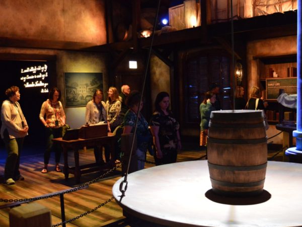
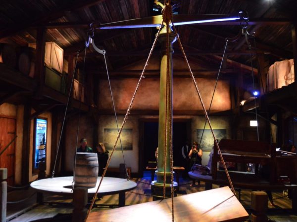
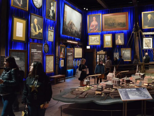
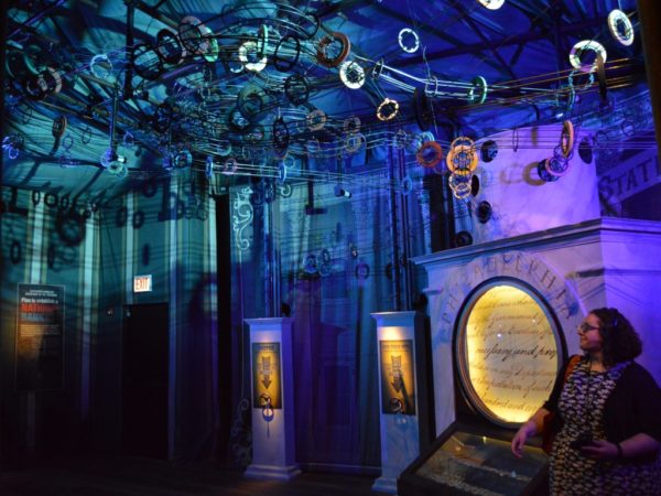
It’s not just the gorgeous lighting, which you might expect from a Broadway team. It’s the abundance of visual metaphors for the ideas at hand: balance scales (tradeoffs, valuation, barter), rope (rigging up a new country), off-kilter angles that evoke the instability of the pre-Revolutionary colonies. Some of these, like the rope, are drawn by Korins from his set design, while others were apparently invented for the exhibition. (When’s the last time you saw creative metaphors like these designed into a history museum, without didactic, reductive explanation?)
Those uneasy, canted angles follow you into the next few rooms:
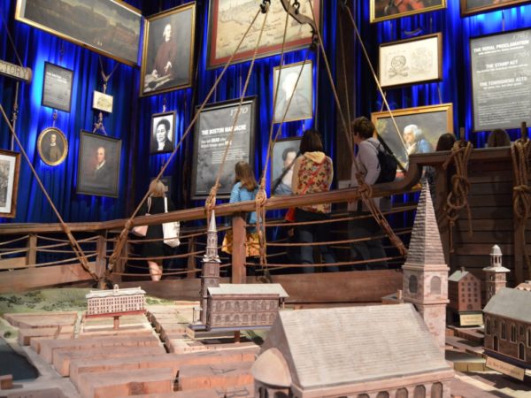
Those paintings hung salon-style are reproductions, by the way, as are most the many handwritten letters displayed in vitrines. But that’s part of why the whole thing works: story over veneration, human character and subjectivity over objects (a topic I’ll return to in my Curator review).
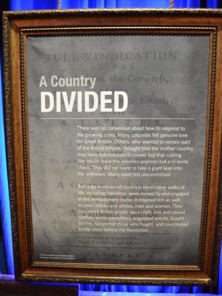
And that story is nuanced. Korins and his crew trust the visitor to withstand, even enjoy, the messy complexities and contradictions of history. You might find the second paragraph of this wall-panel in a history museum, but probably not the first:
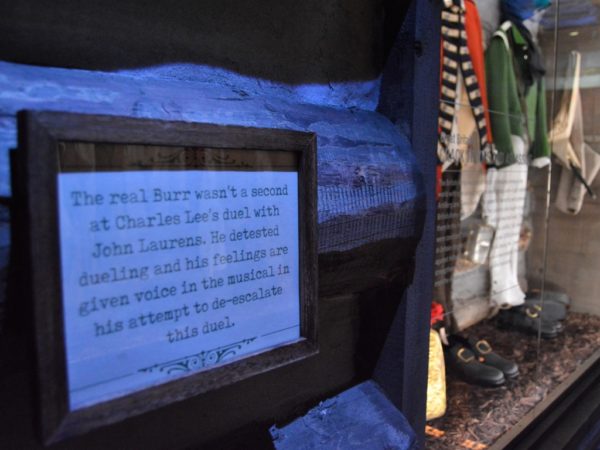
What’s more, they trust you to be able to distinguish between Broadway and history: they make a point throughout the exhibition to acknowledge the artistic license Miranda took with some of the facts.
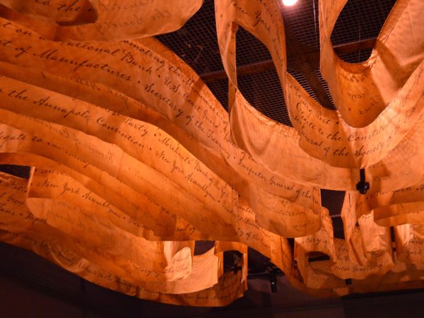
The other governing design motif here is the power of the pen. Words surround us in the exhibition, just as they flow over us in the musical. There must be half a dozen writing desks in the exhibition, each imbued with urgency (“Why do you write like you’re running out of time?”). Often the words here are Hamilton’s own, but most rooms also bear a memorable line from Miranda’s lyrics.
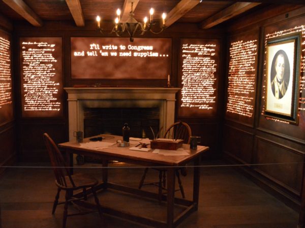
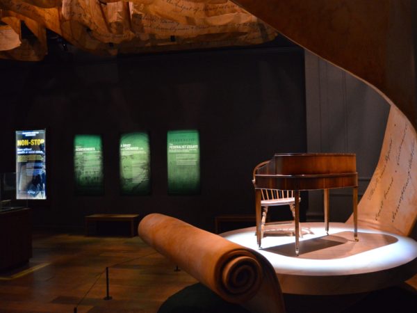
That curving, unfurling banner of words (above) continues over our heads. This is wraparound, immersive design…
…that plays with our bodies in tactile, physical space…
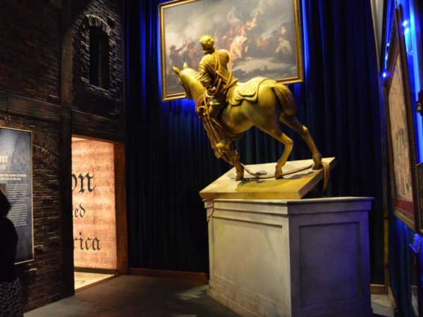
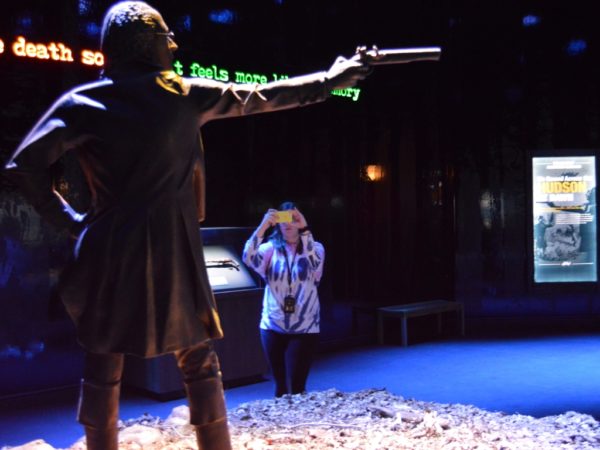
…and in relation to the characters of the historical saga:
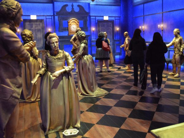
I love that these golden figures aren’t painted realistically, though they are life-size representations of specific people, identified by labels at their feet (which you can zap with your audio-guide player to hear more). Illusion isn’t Korins’ goal; imaginative projection and identification are.
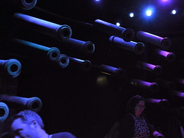
Then, after making our way past an intimidating battery of cannons…
…we enter a large field-tent for the pivotal Battle of Yorktown. We were asked not to photograph it or give too much away, so I’ll just say it’s a tabletop projection with some magical touches, and it manages (like so much else in the exhibition) to be playful and sobering at the same time.
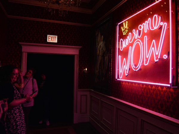
Then a tonal shift, signalled by this neon sign quoting King George’s ironic congratulations to the newly independent United States — one of the most disarming, oft-quoted lines in the musical. This struck me as the least museum-like gesture in the exhibition, and also perfect.
“And so the American experiment begins” — more lyrics, this time glowing from a ceiling beam that spans the next large room, an open space that instantly conveys the energy and work of creating the new nation. Gears turning. More rope (enough to hang ourselves with?). Ingenuity in action.
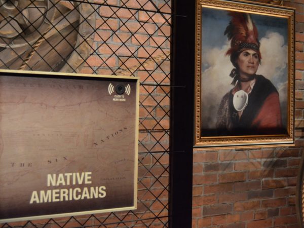
This room isn’t pure celebration, though. Korins and his collaborators — including the Yale historian Joanne B. Freeman, an expert on Hamilton who served as a consulting curator and is quoted by name in the exhibition — also shine a spotlight on some of the people and communities who’ve been ignored in traditional tellings of the American story, including slaves and free African Americans and Native Americans. You’d expect no less from Miranda and his circle, given the musical’s literal and figurative recasting of that story as hip-hop culture, with actors and singers of color in all the roles. But it’s still refreshing here, if sometimes cursory:
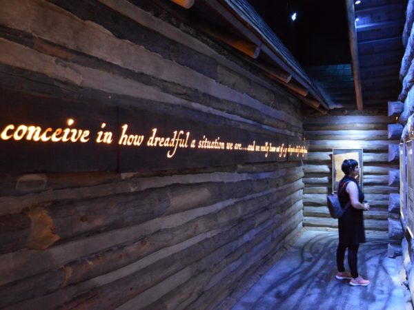
And in the midst of all this country-on-the-make optimism, they let in some of the bitter flavors that were baked into the American cake from the beginning. Hamilton’s warning here is prescient, not just of the Civil War but also our current divides:

Like the musical, the exhibition faces the challenge of making Hamilton’s more abstract but crucial legacies, including monetary policy and our central banking system, both comprehensible and dramatic. Korins and his team play with circus and carnival themes to do this (not pictured), and, less successfully, they borrow a children’s museum trope to physicalize the flow of capital into the federal reserve bank in Philadelphia. Yes, this is one of those gravity-powered ball contraptions (not to mention my colleague Jen Benoit-Bryan, vice president and co-director of research):
The climactic duel, when it comes, feels appropriately, tragically unnecessary.
Here Korins leans a bit more on Miranda’s lyrics, wrapping emotion, imagination, and facts together in a culmination that feels potent and well-earned. Perhaps the least museum-y touch here is the complexity and implicit anger or sadness in this dual timeline that stretches along the wall:
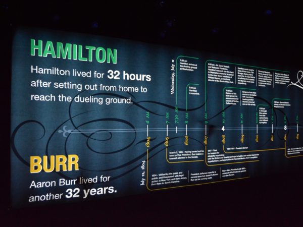
The dual-scale axis takes a moment to figure out. But when it clicks into place, the comparison hits you on multiple levels. What could Hamilton have accomplished with three more decades? If this were a history museum, you could almost hear the curators, designers, and educators worrying that the complexity will lose people. Here, complexity is part of the experience design. Among other things, Hamilton: The Exhibition should put an end to the dusty belief that substance and style are mutually exclusive.
In a bookend to the introductory film, we don 3D glasses for the final room in the exhibition: a 3D projection, with gorgeous sound, of the opening number of “Hamilton,” performed by one of the show’s traveling casts and with Miranda himself as Hamilton. (Sorry, no photos.) Yes, this is cross-promotion; that big budget has to come from somewhere. But it’s also a reminder of why we’re all here, why this story became a cultural and artistic moment in the first place. You walk out humming, caffeinated with creativity.
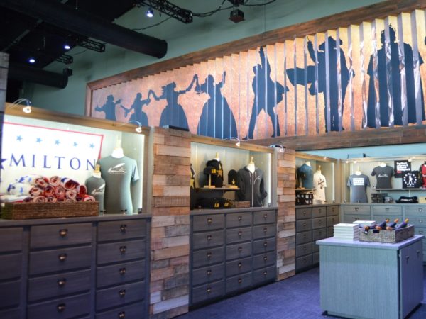
And yes, you exit through the gift shop.
I’d love to hear your thoughts, reactions. How does it strike you? What did I miss? Are nonprofit museums and historic sites already playing with these approaches? And please email me if you’d like to be alerted when my review of the exhibition is published in Curator this fall.